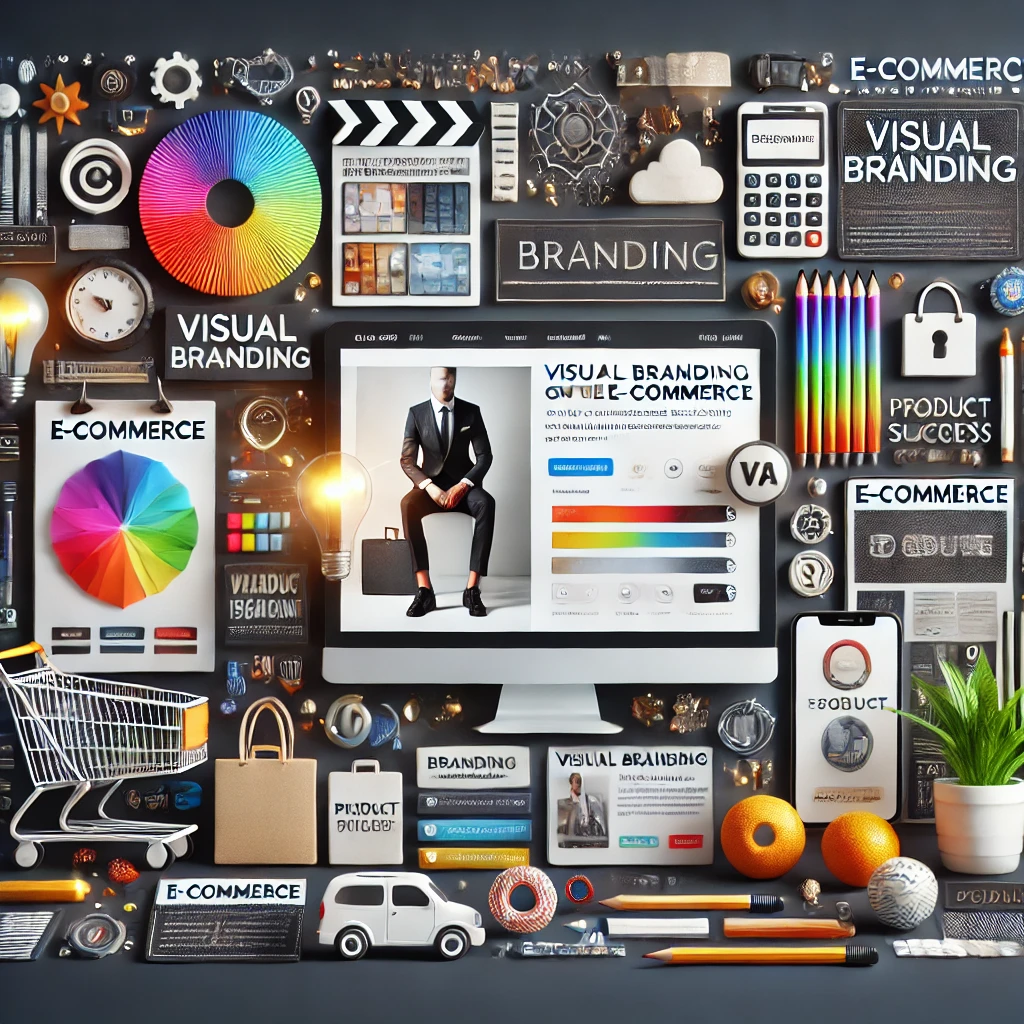
How to Make Your Brand Irresistible
Have you ever clicked on a website and instantly felt a certain emotion? Maybe a cozy warmth, an exciting energy, or even a sense of trust? That’s not just good design—it’s the psychology of colors working its magic. Whether you realize it or not, the colors you choose for your online store can influence how customers feel, react, and, most importantly, decide whether to buy. Let’s dive into the fascinating world of color psychology and how you can use it to boost your online sales.
Why Color Matters More Than You Think
Color isn’t just about making things look pretty—it’s a silent salesman working 24/7 to shape perceptions and drive actions. Studies show that up to 90% of first impressions are based solely on color choices. That means before a customer even reads your product description or checks your reviews, they’re already forming an opinion about your brand.
Imagine you run an online jewelry store. A deep royal blue can communicate luxury and trust, while a soft pastel pink might feel delicate and feminine. On the other hand, if you’re selling fitness gear, vibrant reds and oranges create a sense of energy and urgency. The right color isn’t just a design choice—it’s a sales tool that helps you connect with the right audience.
What Different Colors Say About Your Brand
Each color triggers a different emotional response, and smart brands use this knowledge to their advantage. Let’s break it down:
🟥 Red – Passion, excitement, and urgency. No wonder big sales signs are almost always red! It’s great for flash sales and calls to action.
🟠 Orange – Friendly, energetic, and youthful. Perfect for brands that want to appear fun and approachable, like food or fitness brands.
🟡 Yellow – Happiness and optimism. While it’s eye-catching, too much yellow can feel overwhelming, so use it sparingly.
🟢 Green – Health, growth, and sustainability. Green is often used for eco-friendly brands or anything related to wellness and finance.
🔵 Blue – Trust, stability, and professionalism. This is why banks, tech companies, and corporate businesses love blue—it makes people feel safe.
🟣 Purple – Luxury, creativity, and wisdom. Many beauty and high-end brands use purple to appear sophisticated and premium.
⚫ Black – Power, elegance, and exclusivity. If you want to create a sleek and modern feel, black is your best friend.
Understanding these color associations allows you to design a website that speaks directly to your target customers’ emotions and desires.
How to Use Colors to Increase Conversions
Now that you know what colors represent, how do you apply this knowledge to your online store? Here are some practical ways to use color psychology to increase sales:
1️⃣ Make Your Call-to-Action Buttons Pop – If your “Buy Now” or “Add to Cart” buttons blend in, customers won’t click them. Use a bold, contrasting color to draw attention. Red, orange, and green are great choices for high-converting buttons.
2️⃣ Create a Sense of Urgency – Have you noticed that clearance sale banners are almost always red? That’s because red triggers urgency and excitement. If you want customers to act fast, use red or orange to make your discounts stand out.
3️⃣ Use Blue for Trust-Building Pages – If you have an FAQ section, customer reviews, or a “Why Choose Us” page, consider adding blue elements to reinforce trust and reliability.
4️⃣ Match Your Colors to Your Brand Personality – If you sell natural skincare products, using greens and earth tones will communicate an eco-friendly, organic feel. If you run a high-end watch shop, black and gold will create a sense of luxury and exclusivity.
5️⃣ Avoid Color Overload – Too many competing colors can confuse visitors and make your website look chaotic. Stick to two to three main colors that complement each other.
Typography Choices That Build Trust
Typography is more than just picking a pretty font—it’s a secret weapon for shaping how people perceive your brand. The right font can make your audience feel confident about your business, while the wrong one can send them running for the hills. So, how do you make typography work in your favor? Let’s dive into some trust-building font choices!
Why Typography Matters in Building Trust
Imagine walking into a fancy law firm and seeing a handwritten chalkboard sign at the front desk. Weird, right? That’s because typography sets expectations. A serious business should have a serious typeface, while a playful brand can afford to get a little creative. Fonts affect emotions, and emotions drive decisions. Whether you’re selling handmade candles or running a financial service, your typography should match the level of trust you want to build.
The Best Fonts for Trust and Credibility
Serif Fonts: Classic and Reliable
Serif fonts—those with little “feet” at the edges of letters—are often associated with tradition, reliability, and authority. Brands like The New York Times and Harvard University use serif fonts to convey knowledge and trustworthiness. A font like Times New Roman, Georgia, or Garamond tells people, “We’ve been around, and we know what we’re doing”.
Sans Serif Fonts: Clean and Modern
Sans serif fonts skip the fancy feet and go for a sleek, minimalist look. They’re often used by tech companies and startups because they feel approachable and modern. Google, Facebook, and Apple all use sans serif fonts to make their brands look fresh and innovative. Fonts like Helvetica, Open Sans, or Lato can give your brand a clean, honest, and straightforward appearance.
Script and Decorative Fonts: Handle With Care
Script and decorative fonts can add personality, but they come with risks. A well-chosen script font can make a brand feel elegant or friendly, while a bad one can look unprofessional or even childish. If you go this route, make sure readability doesn’t suffer—because if people can’t read your text, they won’t trust your message.
Typography Do’s and Don’ts for Trust
✅ Do Keep It Consistent
Using too many fonts can make your brand look chaotic and unorganized. Pick one or two that work well together and stick with them across your website, marketing materials, and packaging. Consistency builds trust!
✅ Do Focus on Readability
Fancy fonts are fun, but if people struggle to read them, your message gets lost. Choose fonts that are easy on the eyes, especially for long-form content.
❌ Don’t Use Overly Trendy Fonts
Trendy fonts come and go, but trust is built over time. Stick with classic, professional fonts that won’t feel outdated next year.
❌ Don’t Ignore Spacing and Size
Even the best font can look bad if it’s squeezed too tightly or spaced too widely. Pay attention to line spacing, letter spacing, and font size to create a comfortable reading experience.
Logo Design Trends for E-Commerce Stores
Your logo is the first thing people notice about your e-commerce store. It’s the face of your brand, the digital handshake that tells customers who you are and what you stand for. In 2025, e-commerce logo trends are evolving to keep up with changing consumer expectations, sleek design aesthetics, and the ever-growing online marketplace. Whether you’re launching a new brand or refreshing an existing one, staying on top of design trends will help your business make a lasting impression. Let’s dive into the hottest logo styles shaping the e-commerce world this year!
Minimalist Logos: Less Is More
Minimalist logos continue to dominate, and for a good reason. Customers are bombarded with information online, so a clean and simple logo helps your brand stand out without overwhelming them. Think of brands like Apple, Nike, or Airbnb—no excessive details, just a sleek design that’s easy to recognize at a glance.
A great minimalist logo relies on strong typography, subtle color choices, and clever use of negative space. It creates an effortless, modern feel that signals professionalism and trustworthiness. If your e-commerce store wants to appear high-end, minimalist design is the way to go.
Bold Typography: Making a Statement
Fonts play a major role in logo design, and in 2025, bold typography is taking center stage. Strong, custom lettering helps e-commerce brands convey confidence, authority, and personality. Instead of relying on symbols, many businesses now use their brand name as the main design element, with thick, well-spaced letters that demand attention.
For example, e-commerce brands in fashion, tech, and wellness are using bold sans-serif fonts to appear modern and forward-thinking. Meanwhile, vintage-inspired serif fonts give off a timeless, trustworthy vibe for brands selling handmade, organic, or artisanal products. The key is to pick typography that aligns with your brand’s personality.
Vibrant Colors and Gradients: Adding Energy
While black-and-white logos are classic, 2025 is bringing more vibrant color schemes into the mix. E-commerce brands are embracing bold hues, neon accents, and dynamic gradients to create eye-catching designs that pop on digital screens.
Colors influence emotions, so your brand’s palette should reflect the feelings you want customers to associate with your products. Bright blues and greens feel fresh and innovative, while warm oranges and reds create a sense of excitement and urgency. Gradients add depth, movement, and a futuristic touch, making your logo feel more dynamic and engaging.
Geometric Shapes and Abstract Symbols
Another trend dominating e-commerce logo design is the use of geometric shapes and abstract symbols. Simple lines, circles, and triangles create a sense of balance and harmony, making your logo feel structured and professional.
Abstract icons can also add uniqueness to your brand without being too literal. Instead of using an obvious shopping cart or product-related image, businesses are opting for subtle, artistic symbols that create curiosity. These abstract elements make your brand feel more creative and modern.
Hand-Drawn and Organic Logos
If you want your e-commerce store to feel personal and approachable, hand-drawn logos are a fantastic option. These designs bring a natural, authentic touch, perfect for brands selling handmade, eco-friendly, or wellness products.
Hand-drawn logos often feature soft, imperfect lines, watercolor textures, and playful illustrations. They make your brand feel friendly and unique, standing out in a digital world full of perfectly polished, corporate-looking logos. If your e-commerce business values creativity and craftsmanship, this style is a great fit.
Adaptive and Responsive Logos
With e-commerce businesses operating across multiple platforms—websites, social media, apps, and packaging—logos need to be flexible. In 2025, adaptive logos are becoming a must-have. These designs adjust to different screen sizes and backgrounds without losing their impact.
Think of a logo that looks great as a full-size website header but also works as a tiny social media icon. Brands are creating simplified versions of their logos for mobile apps while keeping their core identity intact. Responsive logos help maintain consistency while ensuring your branding remains clear in every format.
How to Maintain a Consistent Brand Identity
Building a strong brand is only half the battle—you also have to maintain consistency across every platform where your audience interacts with you. A consistent brand identity helps customers recognize you, trust you, and remember you when they’re ready to make a purchase. But with so many digital touchpoints, keeping everything aligned can feel like juggling flaming torches. Don’t worry—we’ve got you covered! Here’s how you can keep your brand identity rock solid.
Define Your Brand’s Core Elements
Before you can maintain brand consistency, you need to clearly define what your brand stands for. Think of your brand as a person—what are its values, personality, and unique style? This includes your mission statement, color palette, typography, logo usage, and even the way you communicate with your audience.
Once you’ve nailed down these elements, document them in a brand style guide. This guide acts as your brand’s rulebook, ensuring everyone on your team follows the same design and messaging standards. When new team members join, this guide will be their go-to resource for keeping everything consistent.
Keep Your Visual Identity Consistent Everywhere
Your brand’s colors, fonts, and logo should be instantly recognizable across all platforms—whether it’s your website, social media, or email newsletters. Imagine scrolling through Instagram and spotting a Coca-Cola red background with its signature script font. Even without the logo, you’d probably recognize it, right? That’s the power of a consistent visual identity.
Make sure your graphics, templates, and brand imagery align across all channels. If you’re using different fonts in your emails and website, it can confuse your audience and weaken your brand identity. Stick to a uniform color scheme and ensure all visuals match your brand’s personality.
Create a Distinct Brand Voice and Stick to It
Your brand voice is how you communicate with your audience—it’s like the personality behind your words. Are you fun and playful, professional and serious, or warm and conversational? Whatever tone you choose, keep it consistent across all platforms. Your social media captions, website content, emails, and even customer service responses should all sound like they come from the same person.
For example, if your brand voice is quirky and humorous, your emails should reflect that same personality. If your website is polished and formal, but your Instagram captions sound like a stand-up comedy routine, your audience may get confused.
Align Your Content with Your Brand Values
Every piece of content you create should align with your brand’s core values and messaging. If your brand promotes sustainability, your content should reflect that—whether through eco-friendly product recommendations, tips on reducing waste, or showcasing your sustainable business practices.
Consistency isn’t just about visuals and tone—it’s also about what you talk about. If your e-commerce brand sells handmade crafts, your content should focus on creativity, craftsmanship, and DIY culture. Random posts about the latest tech gadgets won’t resonate with your audience or strengthen your brand identity.
Train Your Team and Partners
Your brand identity is only as strong as the people representing it. If you have a team handling social media, customer service, or content creation, they should all be on the same page about your brand guidelines. A well-informed team ensures that every interaction with customers remains consistent.
Host brand training sessions or create a shared document with do’s and don’ts for your brand’s messaging and visuals. Even if you’re a one-person business, having a documented brand strategy will help you stay consistent as you grow and outsource tasks.
Adapt Without Losing Your Identity
Trends change, industries evolve, and your brand will likely need to refresh its look over time. However, updating your branding doesn’t mean you should abandon everything that makes you recognizable. The key is to evolve while keeping your core identity intact.
Think about major brands like Starbucks or Pepsi. They’ve redesigned their logos over the years, but their core brand elements—colors, typography, and overall feel—remain familiar. If you plan to refresh your brand, keep the essential aspects that customers already associate with you.
Be Consistent Across All Customer Touchpoints
Your audience interacts with your brand in multiple ways—your website, social media, emails, ads, packaging, and even customer service chats. If you’re saying one thing on Instagram and something completely different in your emails, your brand message can feel disjointed.
For example, if your brand promises exceptional customer support, that experience should be reflected everywhere—from your chatbot’s responses to your return policy emails. Consistency builds trust, and trust leads to loyal customers.
Final Thoughts
Your visual branding isn’t just decoration—it’s the silent ambassador of your brand. From the colors you choose to the fonts and logo you design, every visual element plays a part in how customers perceive and interact with your business. A well-crafted, consistent brand identity not only attracts attention but also builds trust, enhances credibility, and ultimately drives sales. Whether you’re launching a new e-commerce store or refreshing an existing one, investing in strong visual branding is a game-changer in today’s competitive market.